A place to build
Bring ideas, knowledge, and everyday work into one space. Give your team the building blocks to make something their own.
beUI Pro for mobile is live — 50 React Native blocks and screens
Premium content blocks that pair strong narrative hierarchy with image-led metrics, capabilities, customer journeys, and supporting calls to action.
content-platform-overview.tsxThree illustrated capability columns with animated artwork, feature links, and supporting metrics.
THE WHOLE PICTURE
Three connected layers. One less thing to work around.
Bring ideas, knowledge, and everyday work into one space. Give your team the building blocks to make something their own.
Keep your tools talking and your projects moving. Turn the small steps between people and systems into a smoother working day.
Start with a small team. Grow without starting over. A dependable foundation keeps the details handled as your ambitions get bigger.
"use client";
import { ContentPlatformOverview } from "@/components/premium/content-sections/content-platform-overview";
export function ContentPlatformOverviewPreview() {
  return <ContentPlatformOverview />;
}
Get access to install premium components and view the full source.
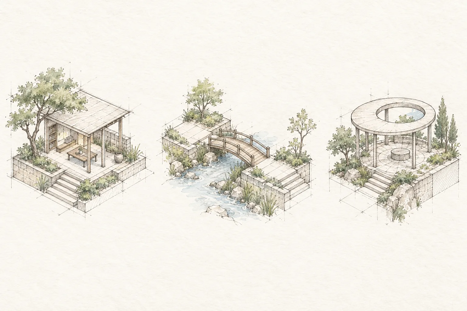
Open dashboardcontent-metrics-gallery.tsxThree image-backed metric cards with hand-drawn isometric sketches, theme-aware fades, responsive stacking, and restrained reveal motion.
"use client";

import { ContentMetricsGallery } from "@/components/premium/content-sections";

export function ContentMetricsGalleryPreview() {
  return (
    <ContentMetricsGallery backgroundImage="/content/metrics-isometric.webp" />
  );
}
Get access to install premium components and view the full source.
Open dashboardcontent-capability-showcase.tsxAn asymmetric narrative and capability layout with a blur-revealed heading, concise proof points, and two duotone nature cards with crisp dithered artwork.
Turn loose ideas into clear plans without losing the context behind them.
ExploreConnect the steps, owners, and approvals that carry work through delivery.
Exploreimport { ContentCapabilityShowcase } from "@/components/premium/content-sections/content-capability-showcase";
export function ContentCapabilityShowcasePreview() {
return (
<ContentCapabilityShowcase backgroundImage="/content/capability-duotone.webp" />
);
}
Get access to install premium components and view the full source.
Open dashboardcontent-value-grid.tsxA centered statement with three grain-textured illustration cards, clear value summaries, paired calls to action, and restrained reveal motion.
Give every idea, decision, and handoff a clear place to move forward.
Shared direction
Keep the thinking, decisions, and next steps together from the start.

Steady delivery
Give each owner the context they need without another status meeting.
Flexible by design
Start with the way you work today, then adapt it as the team grows.
Bring the process you have. Make it easier to run.
import { ContentValueGrid } from "@/components/premium/content-sections/content-value-grid";

export function ContentValueGridPreview() {
  return <ContentValueGrid backgroundImage="/content/value-grain.webp" />;
}
Get access to install premium components and view the full source.
Open dashboardcontent-engagement-sequence.tsxA customer-engagement story with watercolor journey artwork, rounded product scenes, selectable chapter cards, and viewport-aware playback.
Getting started
Your workspace is ready
import { ContentEngagementSequence } from "@/components/premium/content-sections/content-engagement-sequence";

export function ContentEngagementSequencePreview() {
  return (
    <ContentEngagementSequence backgroundImage="/content/journey-sketch.webp" />
  );
}
Get access to install premium components and view the full source.
Open dashboard