beUI Pro 移动端已上线:50 个 React Native 区块和页面

Tab bars
2 个变体
Bottom tab bars in three styles, and tabs over swipeable pages with a pill that follows your finger.
Tab Bar
区块3 种样式Three bottom tab bars: a gliding pill, a tab that grows to show its label, and a centre button that fans out shortcuts.
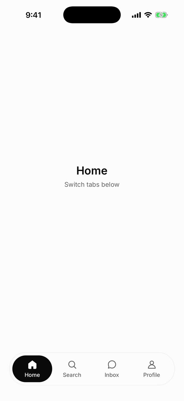
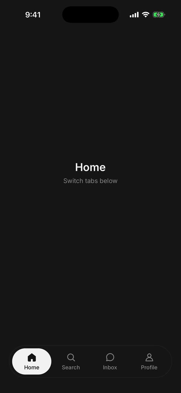
添加它的 9 个文件、2 个共享的 beUI Native 文件,以及 components/beui-pro 下的主题变量,并保留文件夹结构,确保相对导入正常解析。
$ bunx --bun shadcn add @beui-pro/native-tab-bar
Scroll Tabs
区块Tabs over swipeable pages, with a pill that follows your finger and stretches toward the next tab.

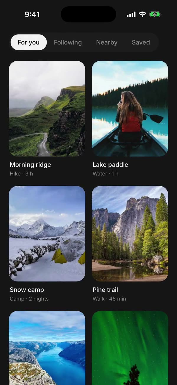
添加它的 5 个文件、1 个共享的 beUI Native 文件,以及 components/beui-pro 下的主题变量,并保留文件夹结构,确保相对导入正常解析。
$ bunx --bun shadcn add @beui-pro/native-scroll-tabs
依赖库
使用 Expo 安装以匹配你的 SDK 版本,然后在全局 CSS 中 Tailwind 和 Uniwind 之后导入 components/beui-pro/beui/styles/theme.css。已在 Expo SDK 58 上测试。新应用?按照设置指南操作。
npx expo install react-native-reanimated react-native-svg react-native-worklets
npm install uniwind tailwindcss
源码包含在移动端和 Web + 移动端许可证中。
获取移动端